Getting granular on a national scale
/Looking at weather.com just now to see if the several inches of snow we received yesterday will melt rapidly, I found an interactive map of reported instances of covid-19 at the county level.

weather.com’s interactive map of reported covid-19 infections. Screen shot taken at about 8:40am (Eastern) on 24 March 2020. Click on map to go to original source.
The system still uses a choropleth to map absolute values, though, but it has a logical and consistent scale and much better granularity than the CDC maps, and much greater geographical coverage than the Maine map by Rosemary Mosher I posted yesterday.
I now see that the New York Times is using county-level graduated circles for their US maps of infection:
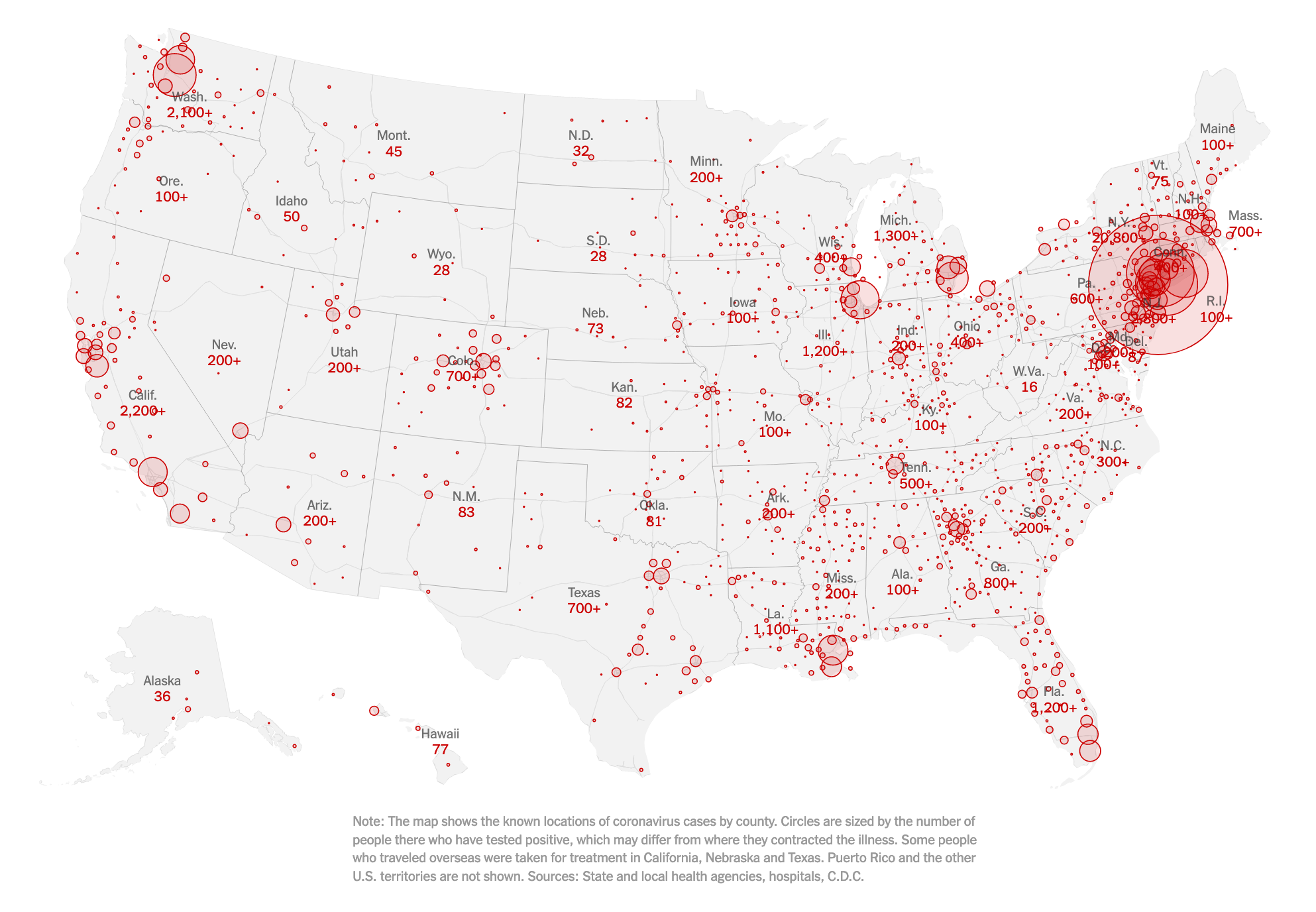
Click on map to link to source.
[update 25 March 2020] And the Guardian is following the lead of the Grey Lady:

Guardian’s map of US recorded corvid-19 cases. Click on map to go to source.


